CRM Interface Redesign for B2B
Improving Procurement Efficiency with Multicurrency, Filters & Status Indicators
Client
NDA
Services
UX/UI Design
Industries
B2B
Date
2024
Context
I developed a concept for a CRM system interface in Figma during the presale stage for a corporate client focused on procurement management and document flow. The client faced inefficiencies with the existing system due to complex navigation and inadequate adaptation to an increasing volume of tasks. This became the basis for updating the interface to overcome existing limitations and ensure seamless handling of the growing number of tasks.
Challenge
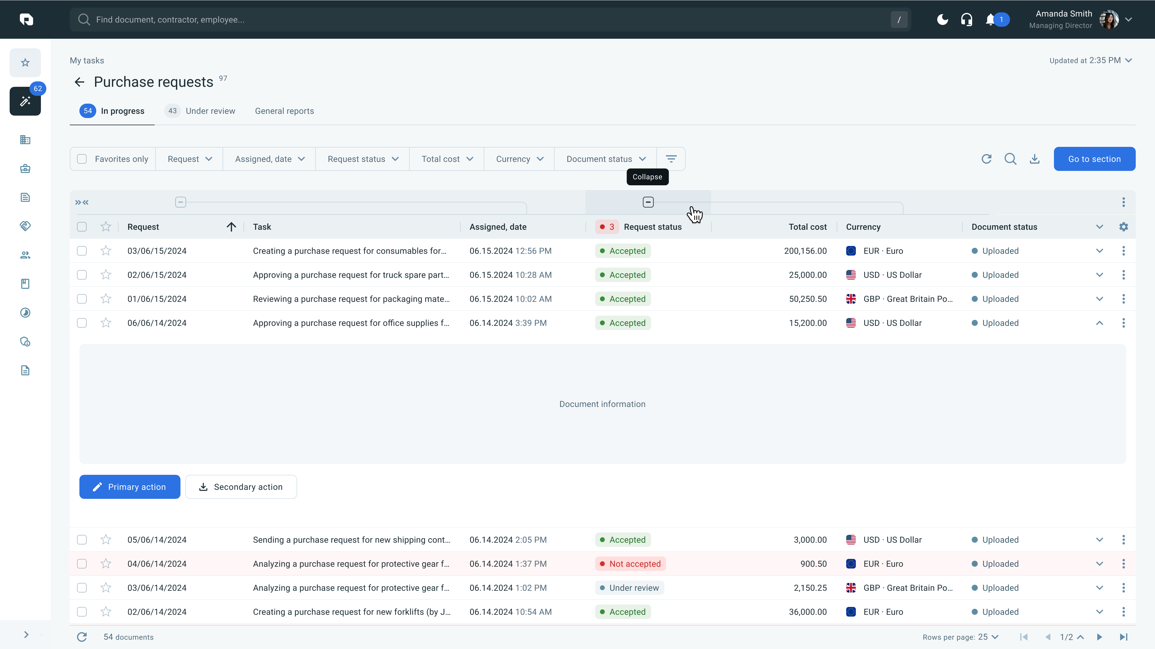
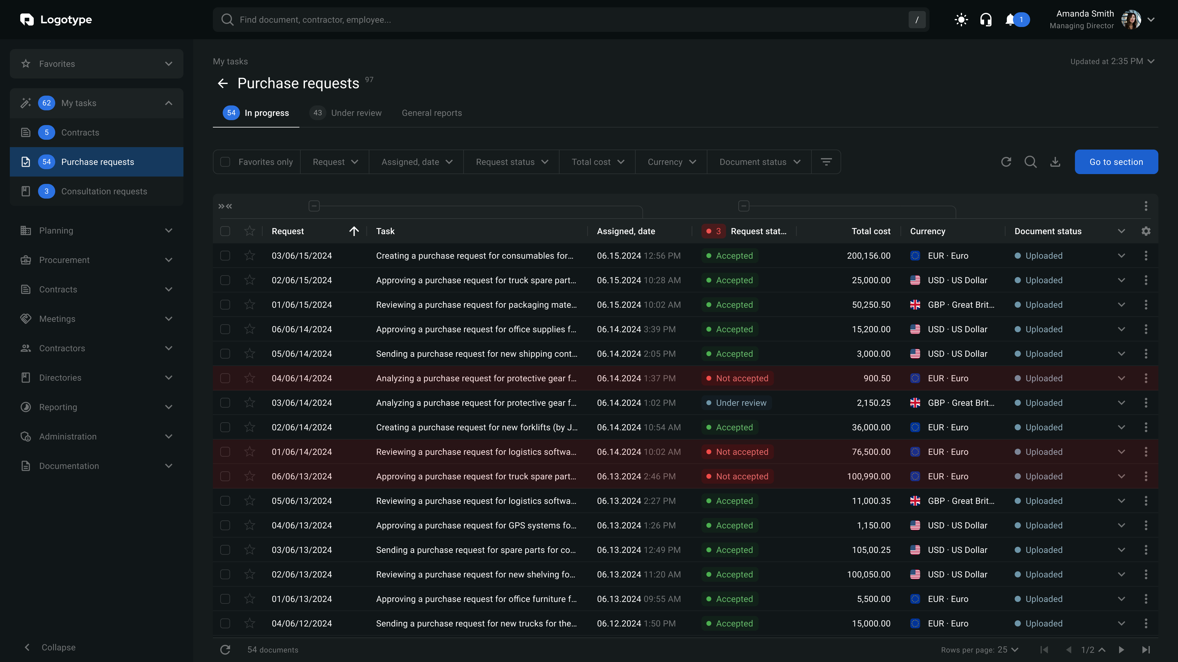
My task was to create an intuitive and scalable interface that would enable users to efficiently manage purchase requests, track document statuses, and analyze costs. It was essential to incorporate support for multi-currency operations, data filtering, and visual status indicators to simplify decision-making.
Process
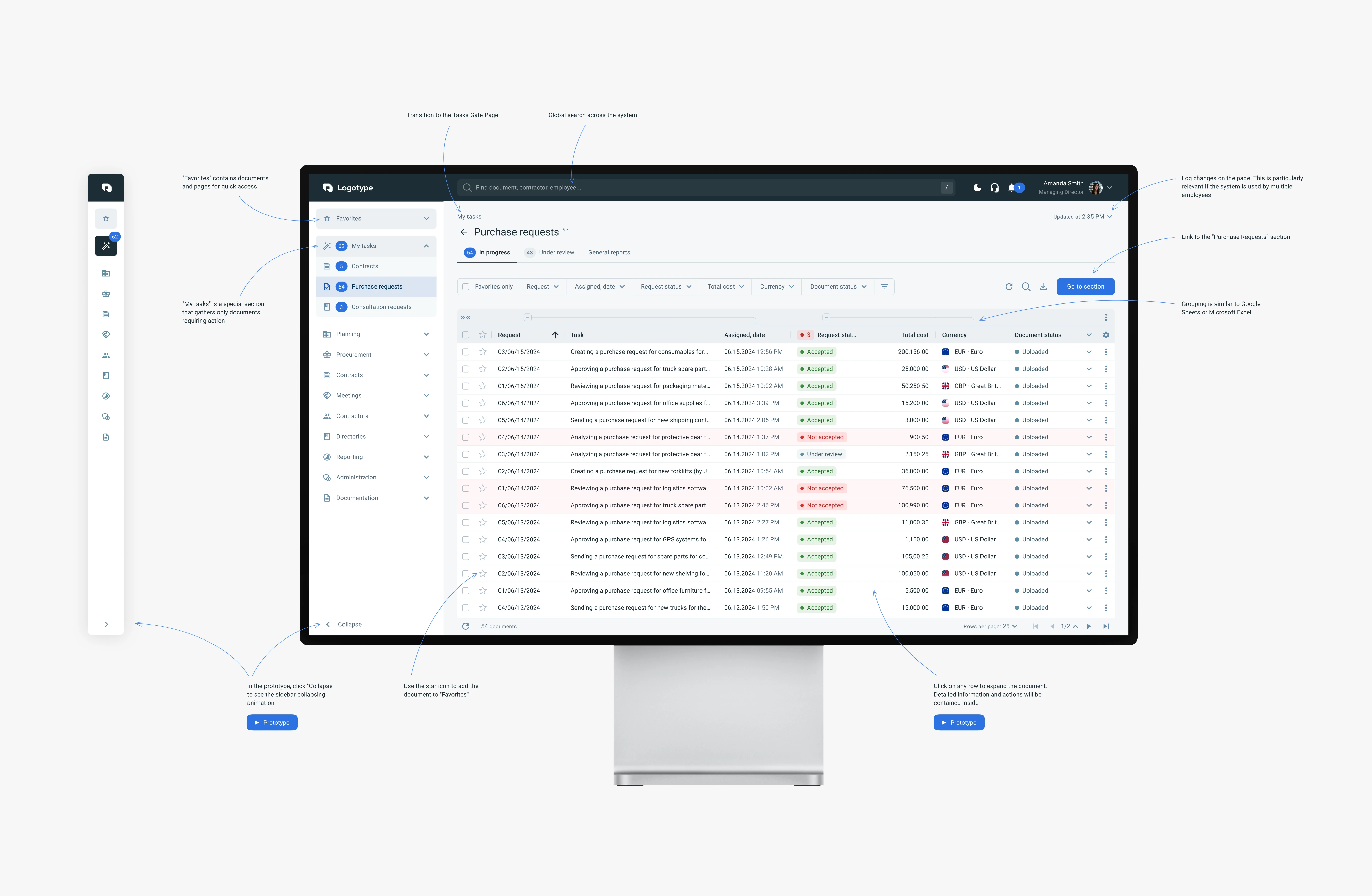
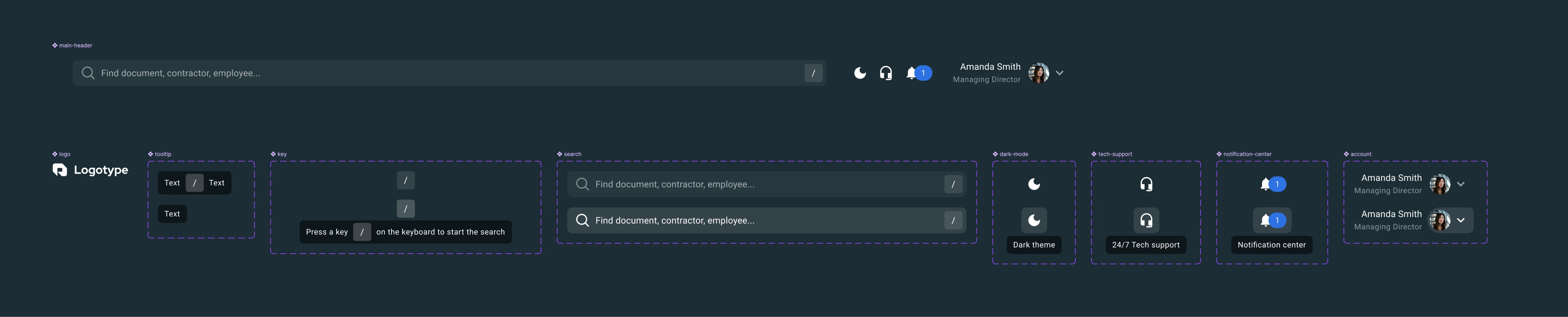
Using the Material UI (MUI) library for consistent styling and scalability, I built the interface on a variables table, allowing for a one-click color scheme switch (light/dark). I added micro-animations (expanding table rows, collapsing the sidebar) and tooltips to enhance user interaction. The process included designing a multi-level navigation structure, featuring a sidebar with categories (e.g., My tasks) and subcategories (such as Purchase requests) for intuitive orientation, developing an interactive table with support for sorting and basic filtering (by date, status, and cost), and implementing a feature for filtering by favorite requests.
Results
The result was an intuitive interface, successfully presented during the presale, which enabled effective request management through an interactive table with detailed filtering by date, statuses (Accepted, Not accepted, Under review), and support for multi-currency operations. The light theme and micro-animations improved user comfort, as confirmed by positive client feedback. Currently, I’m working on a redesign of the system, though details are restricted by an NDA.