Redesigning Decobay’s Website & User Account
Boosting User Engagement and Repeat Purchases
Client
Decobay
Services
UX/UI Design
Industries
Online Retail
Date
2022
Context
Decobay is the largest online store for fabrics and sewing accessories with a catalog of over 10,000 products and an offline network of 5 stores. Despite its impressive scale and assortment, the previous website faced significant issues: an outdated UI, cluttered and illogical navigation, lack of a unified visual language, and an unfriendly user experience.
The company requested a complete redesign of the website and user account to eliminate interface clutter and create a scalable, visually cohesive ecosystem.
My Role
As a Senior UX/UI Designer, I conducted a UX audit, engaged with stakeholders, analyzed data and user behavior, developed the information architecture and visual identity, and collaborated closely with the development and marketing teams. My task was to propose solutions that would make the website intuitive and the purchasing process simple and engaging. Presenting and defending solutions to stakeholders required persuasiveness and the ability to justify decisions, which became a key part of my work.
Challenge
My goal was a deep, product-focused overhaul of the user experience, emphasizing convenient navigation, intuitive interactions, clear structure, and increased user engagement. I needed to address navigation issues that hindered users from quickly finding products, create a visually cohesive design, and introduce new functionality while accounting for existing technical and time constraints.
Approach
I adhere to an iterative approach. When starting the project, it was critical to understand where and why users were getting lost, frustrated, or abandoning the site. The process began with a deep dive into the problem: I conducted a UX audit of the current website, viewing it through the eyes of someone simply trying to buy fabric.
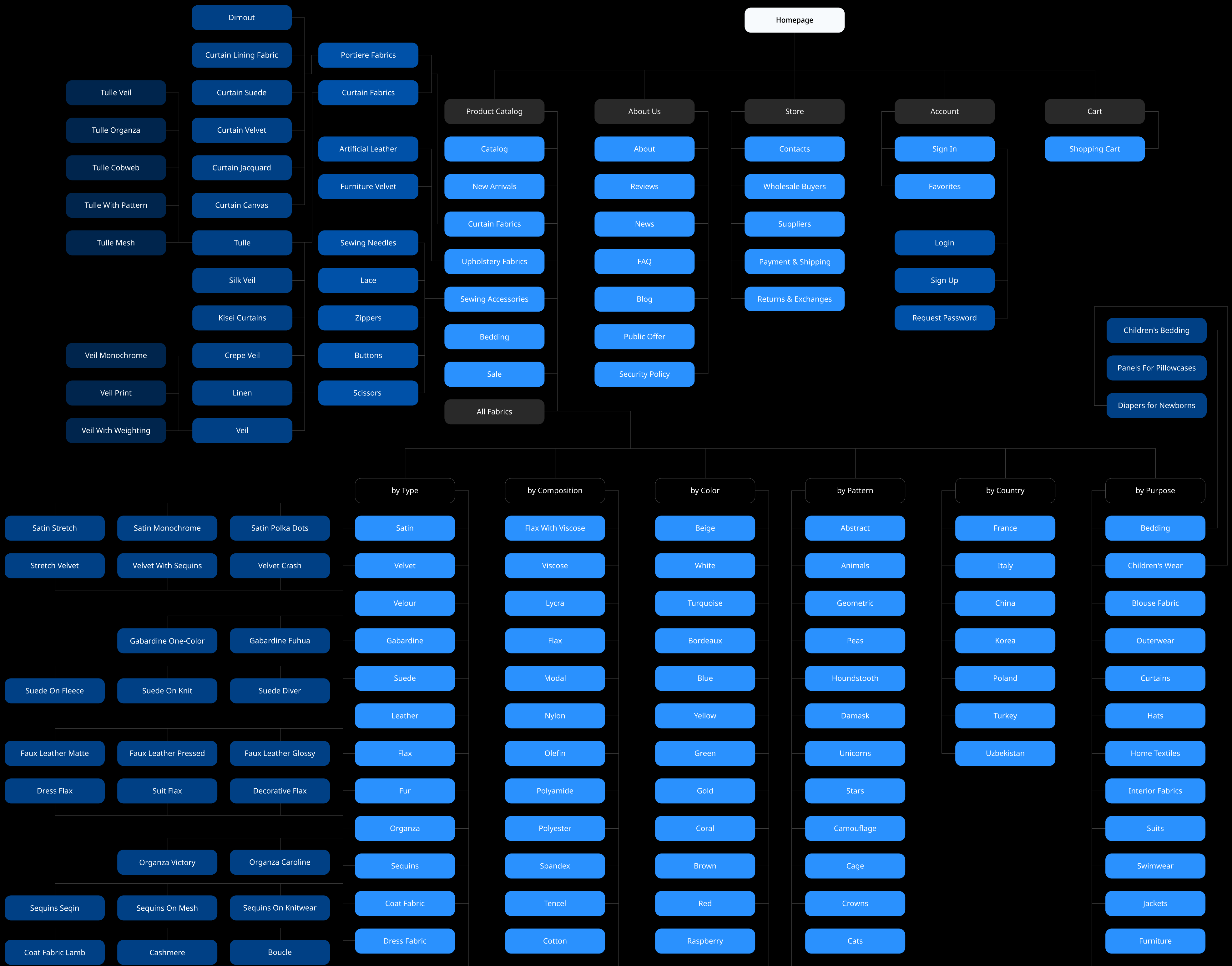
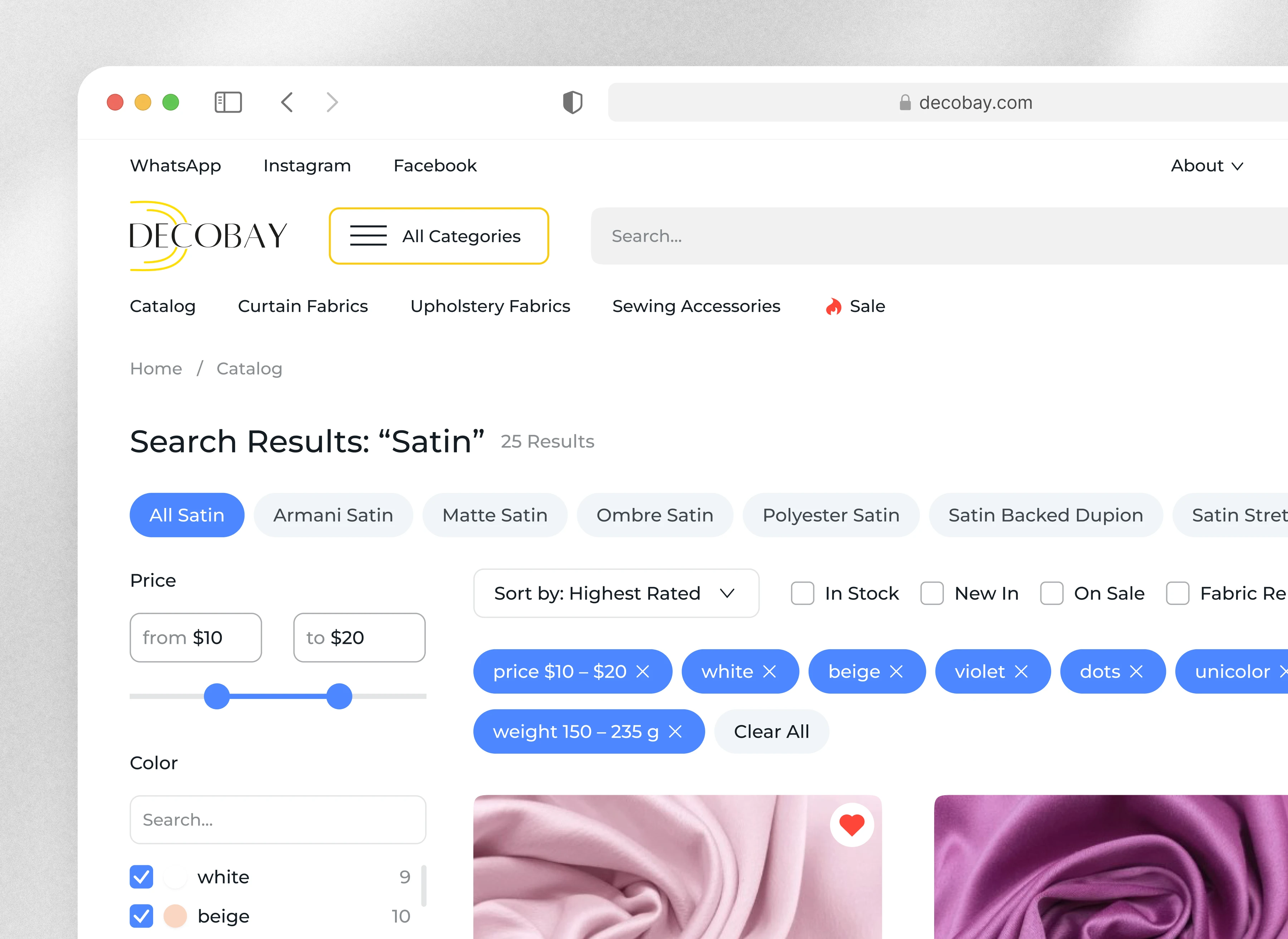
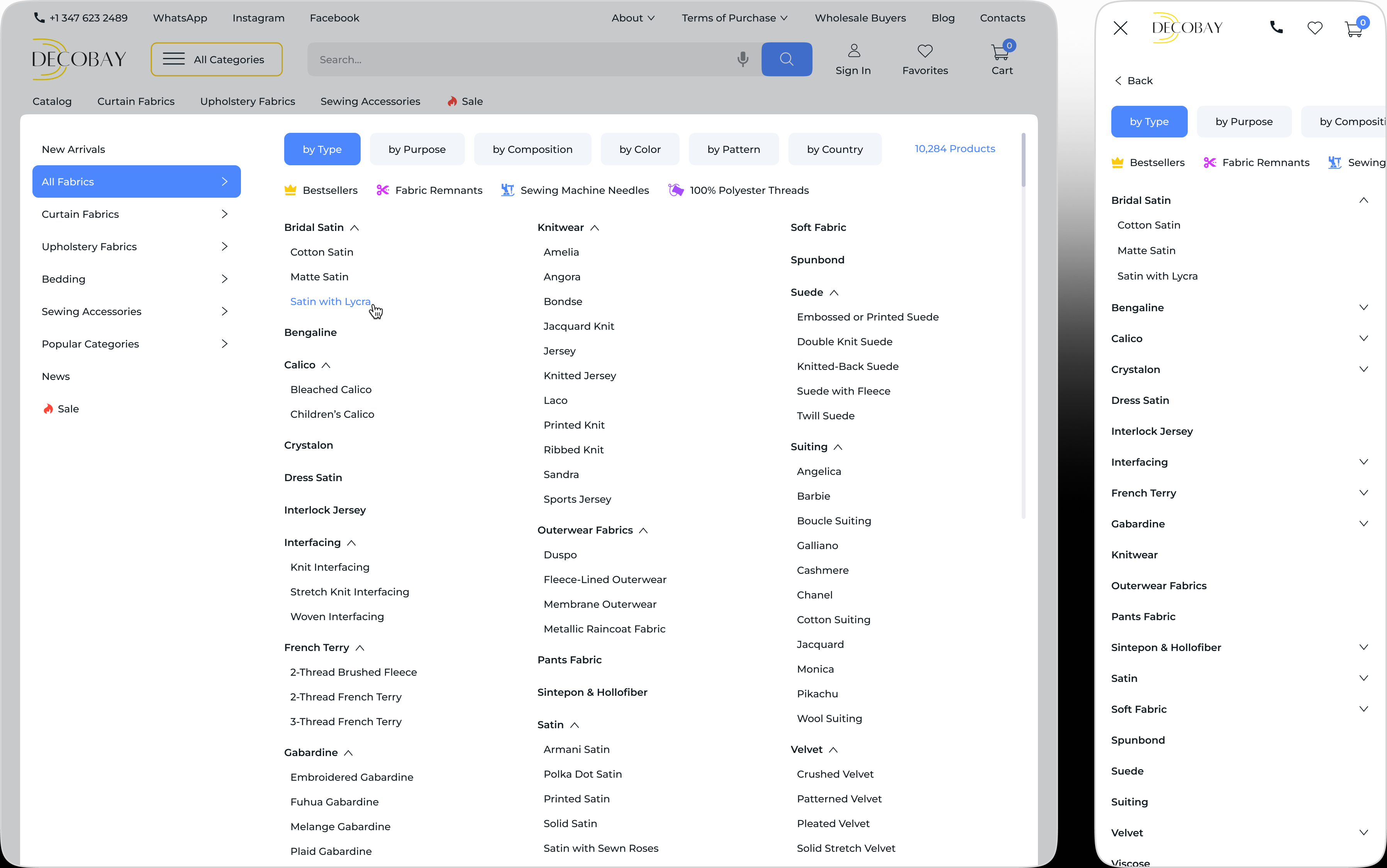
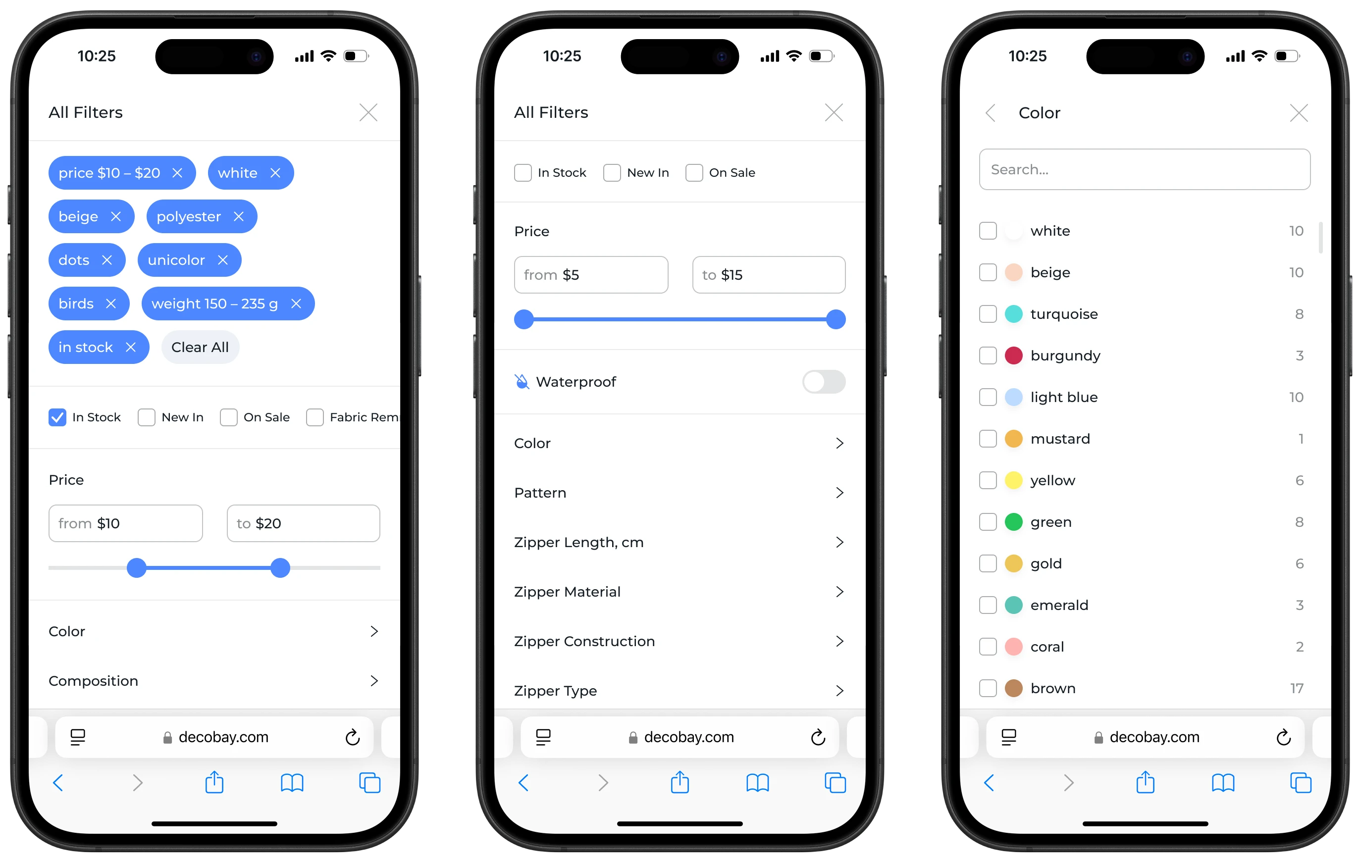
It quickly became clear where the site was "breaking." Users felt like they were navigating a maze where everything was present but impossible to find. Complex navigation, insufficient visual hierarchy, unclear and convoluted menu structures, the absence of filters in 60% of categories (forcing users to waste time searching), a fragmented purchase process with illogical steps, and more. This wasn’t just visual clutter, it was a chaotic system lacking clear logic, forcing users to expend effort to figure out where to click or search.
Research and Insights
The next step was a competitive analysis. I wanted to understand how others tackled similar challenges. I studied 3 direct competitors and 1 indirect competitor, walking through the buyer’s journey on each site to identify what felt convenient and where unexpected difficulties arose. I paid attention to how filters, product cards, category structures, and checkout processes were designed.
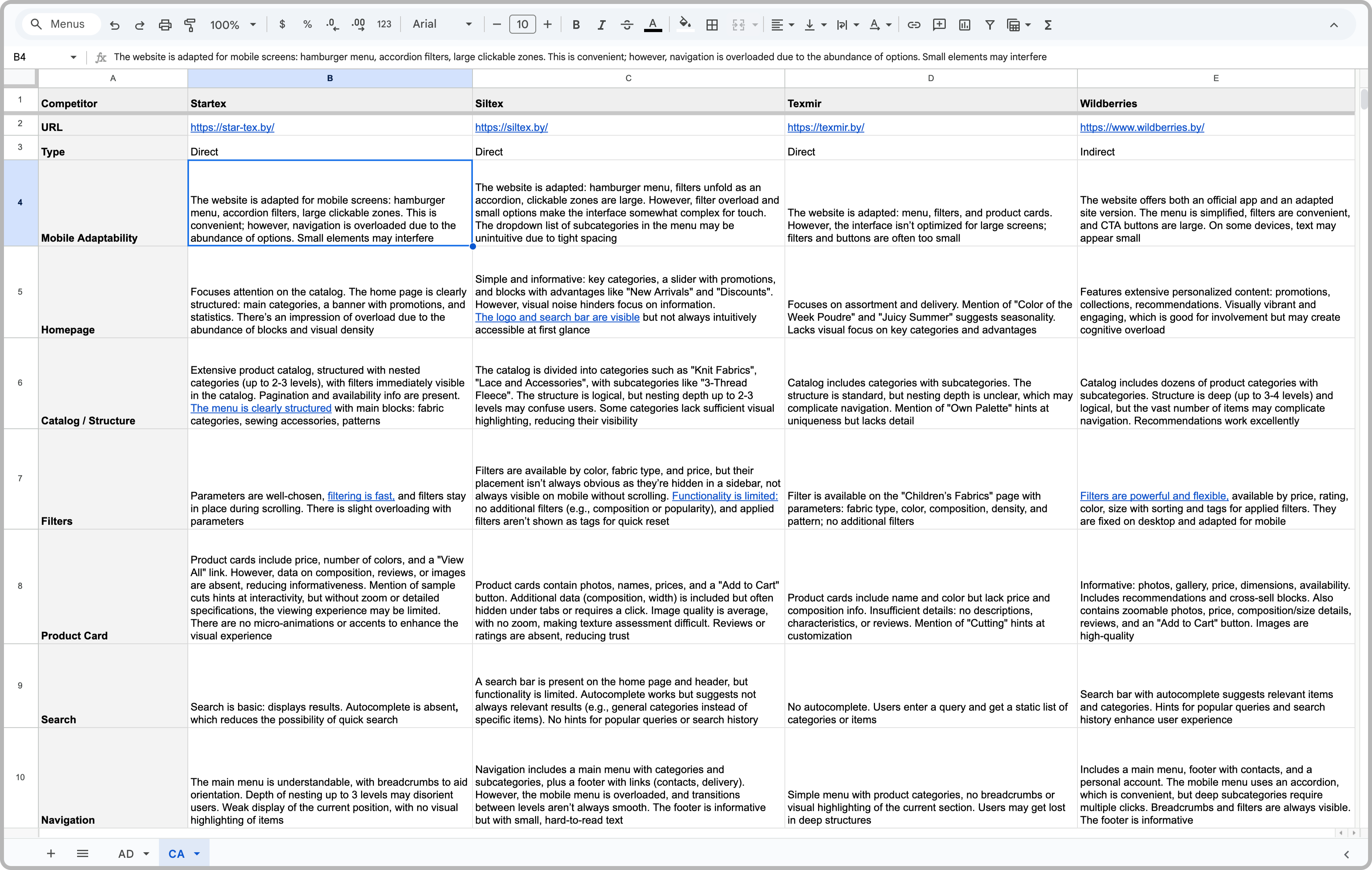
This analysis formed a solid foundation for building a new information architecture and the first prototype. Key insights included:
Prototyping
I developed a low-fidelity wireframe of the homepage, focusing not on visuals but on structure, content logic, and key interaction elements like buttons, product cards, and navigation blocks. We discussed it with the team to determine which solutions to pursue and which to abandon. Based on feedback, I refined some decisions and moved to creating the first prototype, which we tested with clients.
The goal was to validate key scenarios: whether users understood the screen structure, navigation transitions, icon meanings, and entry/exit points for each flow. We focused on confirming or disproving hypotheses early to avoid wasting resources on unviable solutions. This approach allowed us to make informed product decisions before release. All testing was conducted using interactive Figma prototypes, with key questions including:
Does the user understand where they are in the site’s structure?
How easily can the user complete their target action?
Are there difficulties in completing the target action?
Are there moments where the user gets lost or makes errors?
Does the interface inspire trust and predictability?
Feedback showed that users navigated 70% faster and completed key scenarios with greater confidence. However, some challenges persisted, particularly with filtering by specific parameters, which prompted additional iterations. Certain visually overloaded blocks also required refinement to reduce cognitive load and improve readability.
After addressing pain points, I focused on the next level of user experience — engagement. I wanted the interaction with the site to be not only intuitive but also emotionally engaging. Even buying buttons shouldn’t feel dull. I proposed incorporating light gamification elements: bonus points, a progress indicator for free shipping, and micro-animations to make the interface responsive, motivating, and rewarding.
Results
I designed a system with clear flows, intuitive navigation, and a responsive interface. High-fidelity prototypes provided an accurate representation of the final product, while interactive prototypes allowed us to test user interactions live and address issues before development.
The website redesign significantly increased user engagement. Users noted that the purchasing process became intuitive and fast, with navigation now clear and predictable. The mobile interface, thanks to an improved menu structure and optimized filters, now offers seamless interaction at every stage, boosting user satisfaction by 15% and strengthening brand trust, which led to a 10% increase in repeat purchases within the first six months.
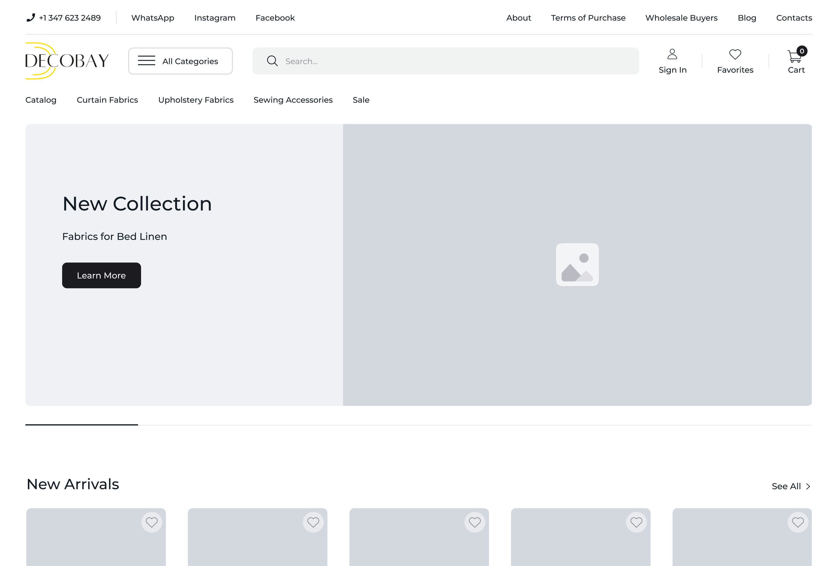
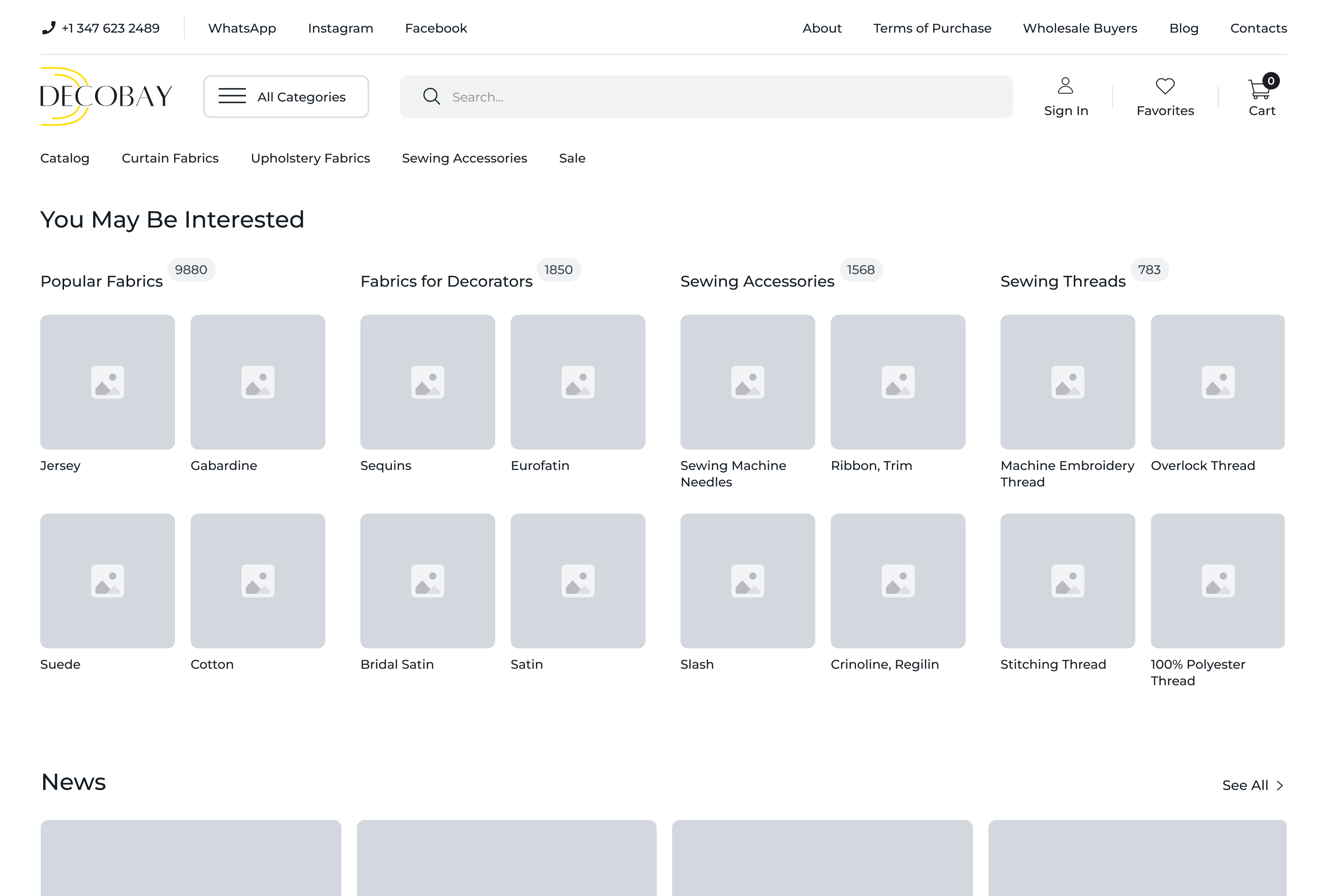
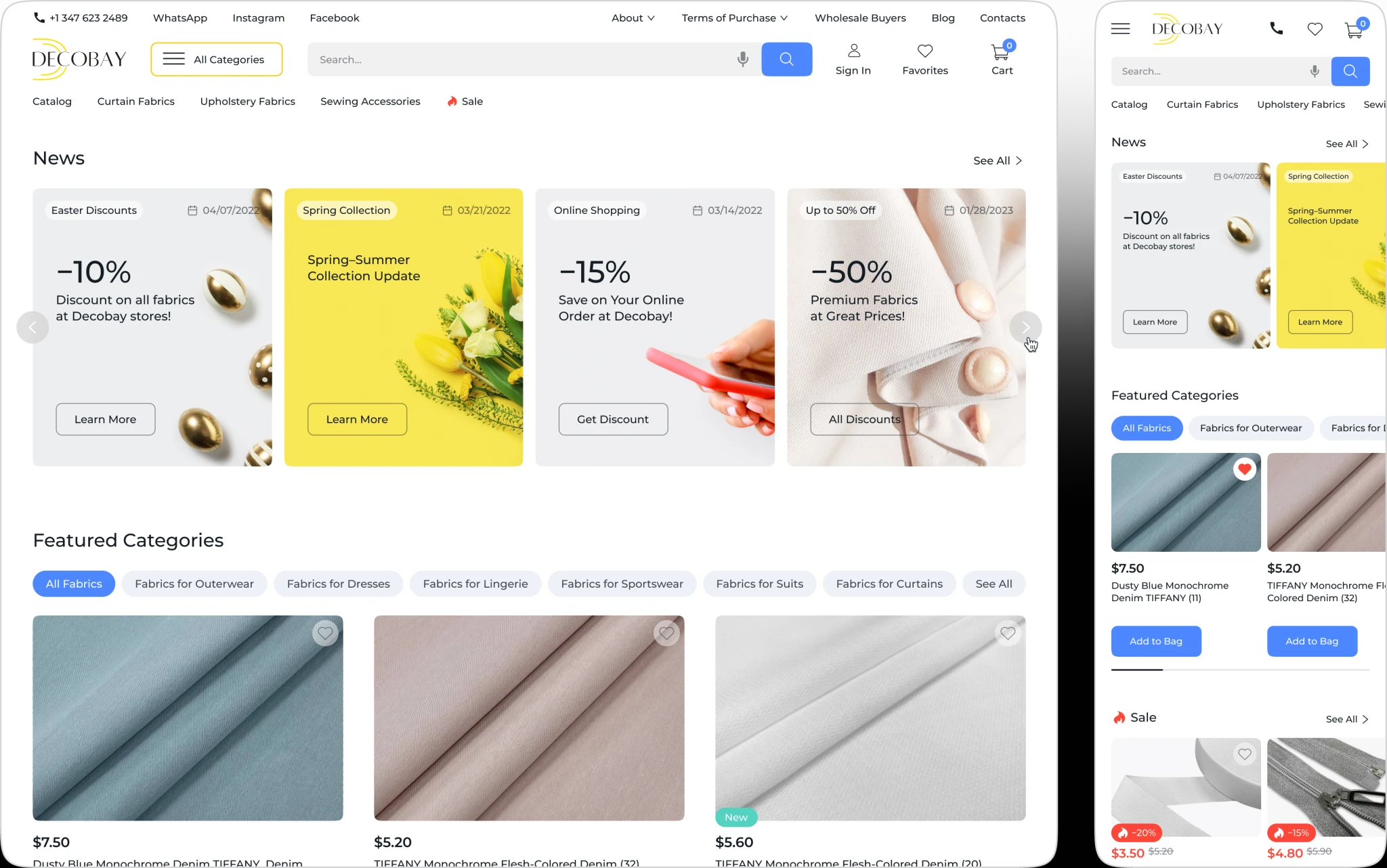
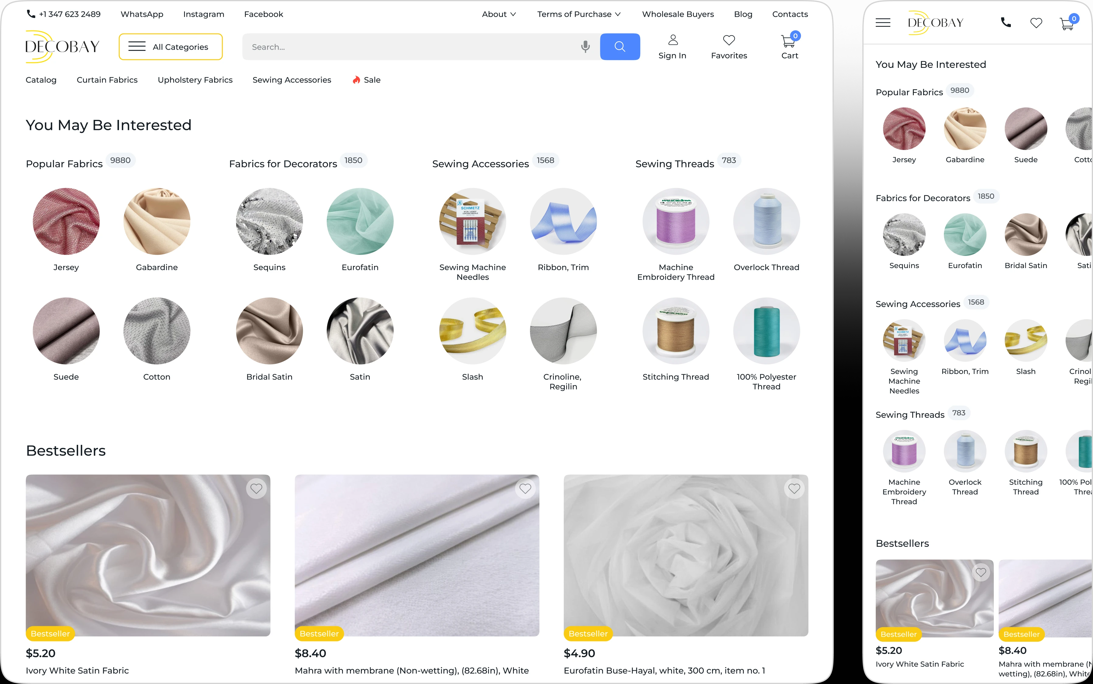
Homepage
Added 5 new content blocks to highlight popular categories, discounted products, and store addresses, improving navigation and engagement.
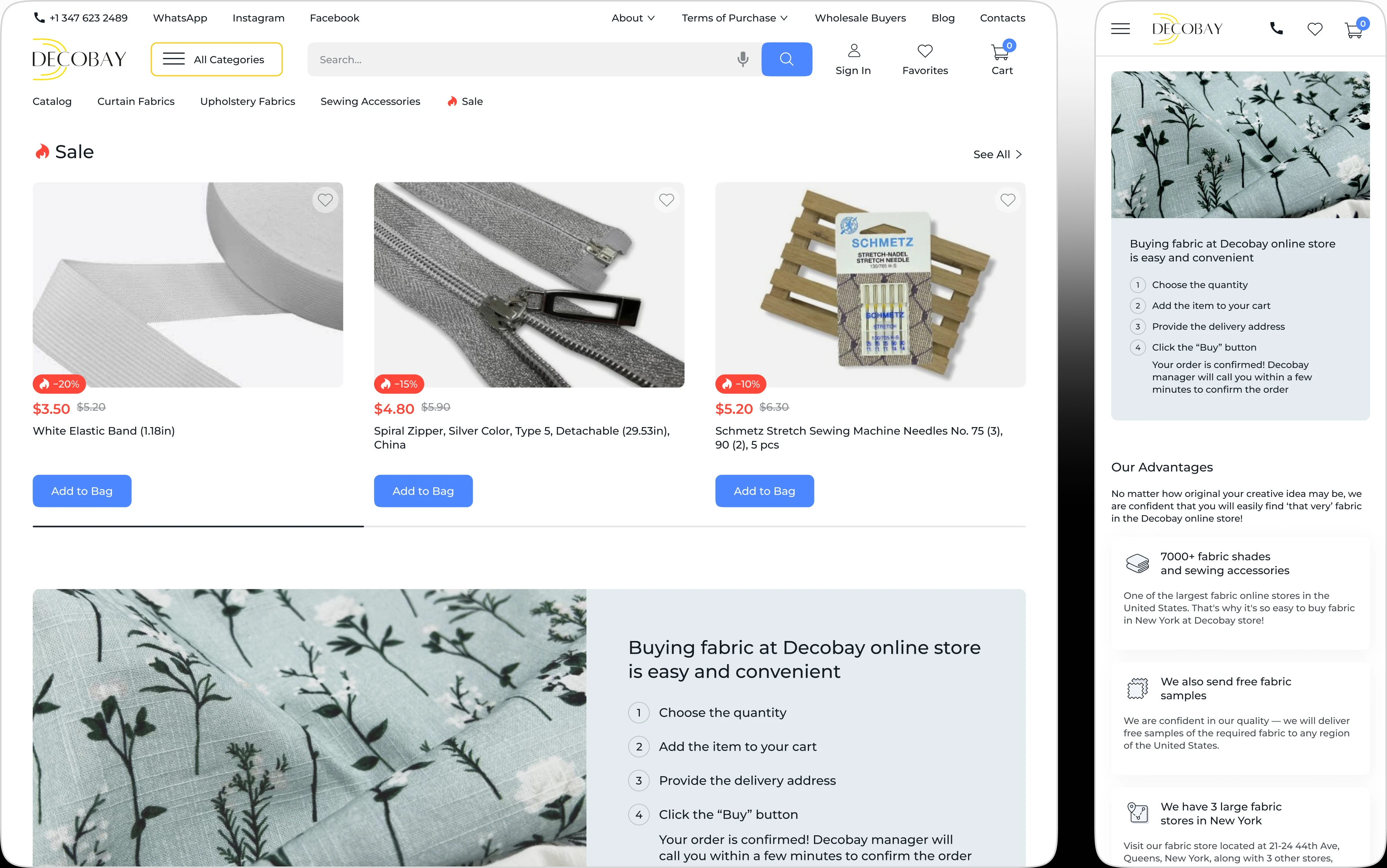
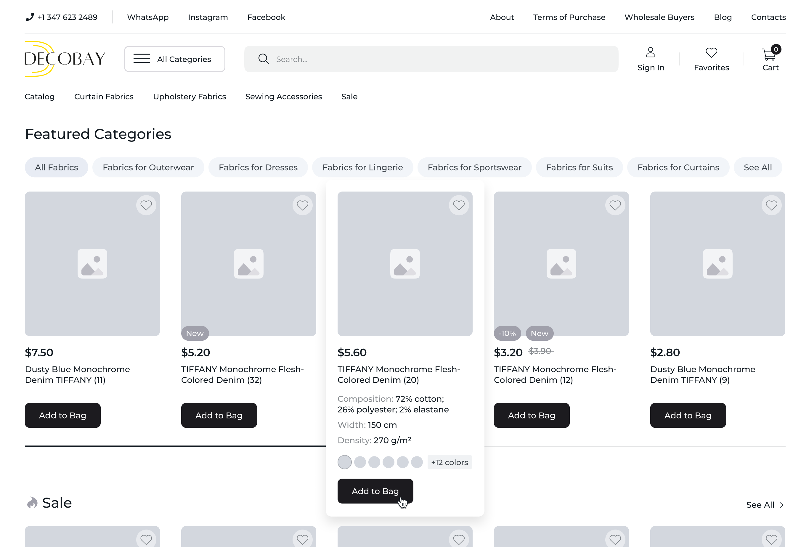
Catalog Pages
Designed a robust filtering system with both primary and secondary parameters (e.g., price, color, material, in-store availability) to simplify search
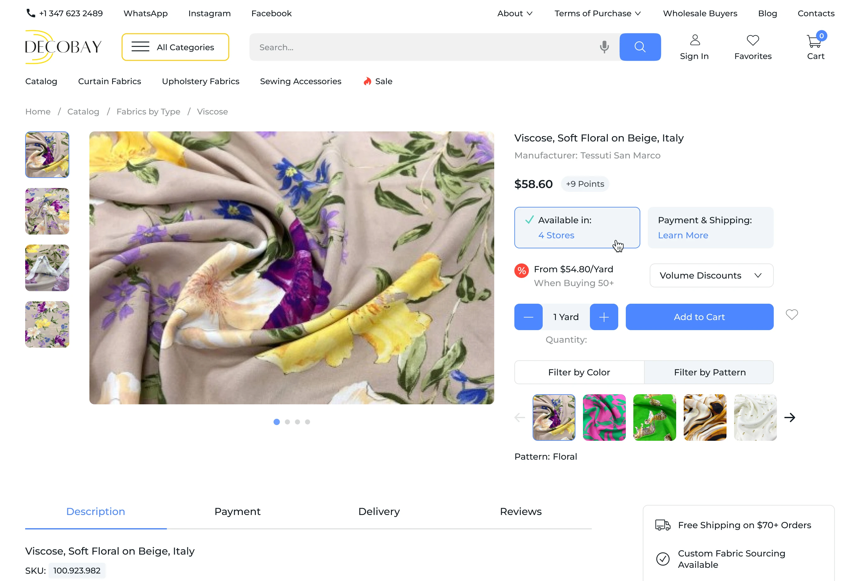
Product Page
Restructured content layout. Added a product availability indicator. The new feature showing in-store stock and delivery details. Included a bulk discount block to highlight savings for larger quantities
Checkout Page
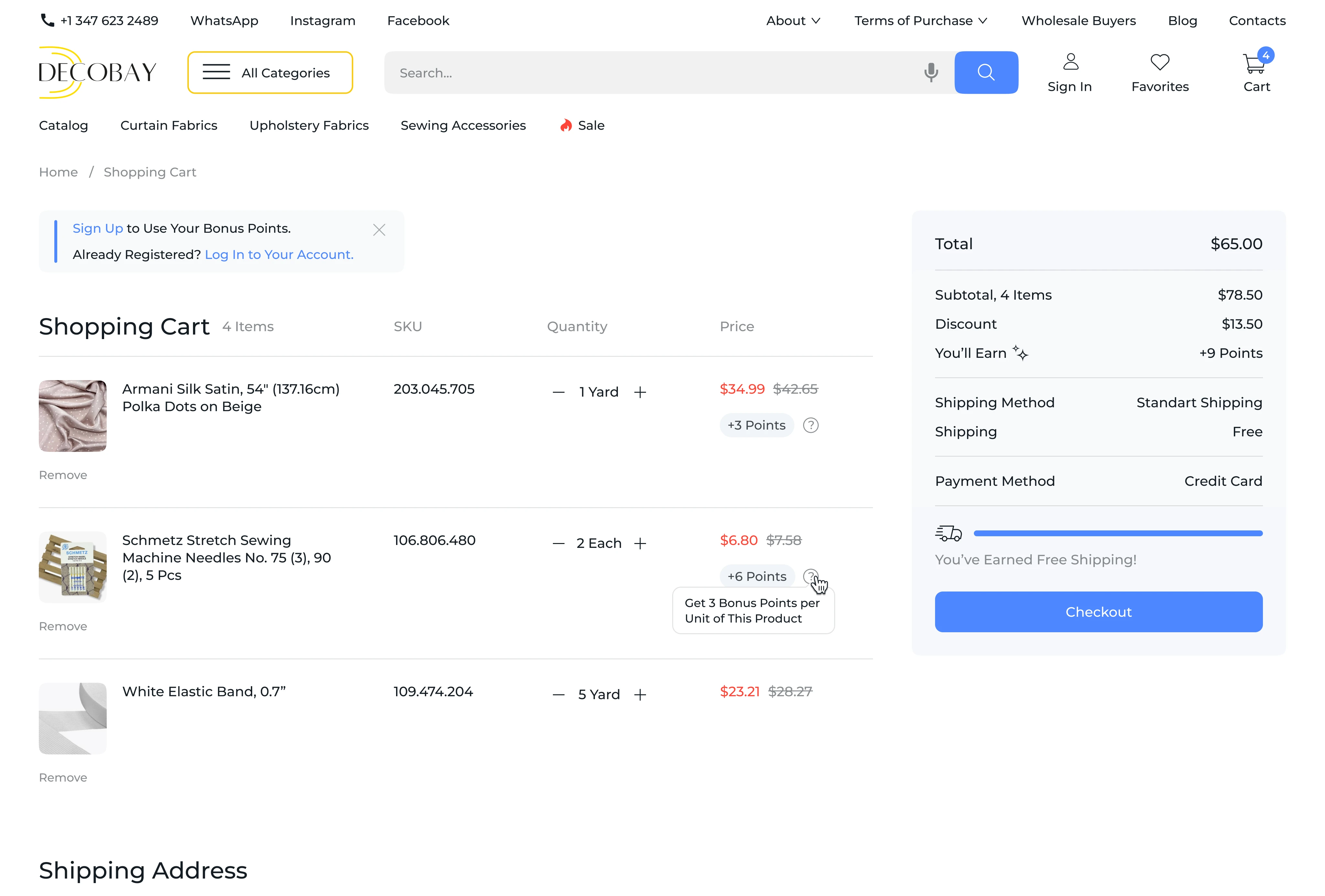
Simplified the checkout process with a progress bar and gamification elements, such as bonus point redemption and a free shipping threshold to encourage purchases.
Before the redesign, the checkout page followed a basic 4-step structure but suffered from several UX issues, especially on mobile devices.
One of the main problems was that users lost sight of the final order total, as the summary block was placed at the top of the page. During the research phase, I discovered that over 80% of users placing orders from mobile devices would first fill out all the fields, select delivery and payment methods, and then scroll back up to double-check the final amount, often “just in case.” This caused frustration and disrupted the flow, making it harder for users to complete their purchase quickly.
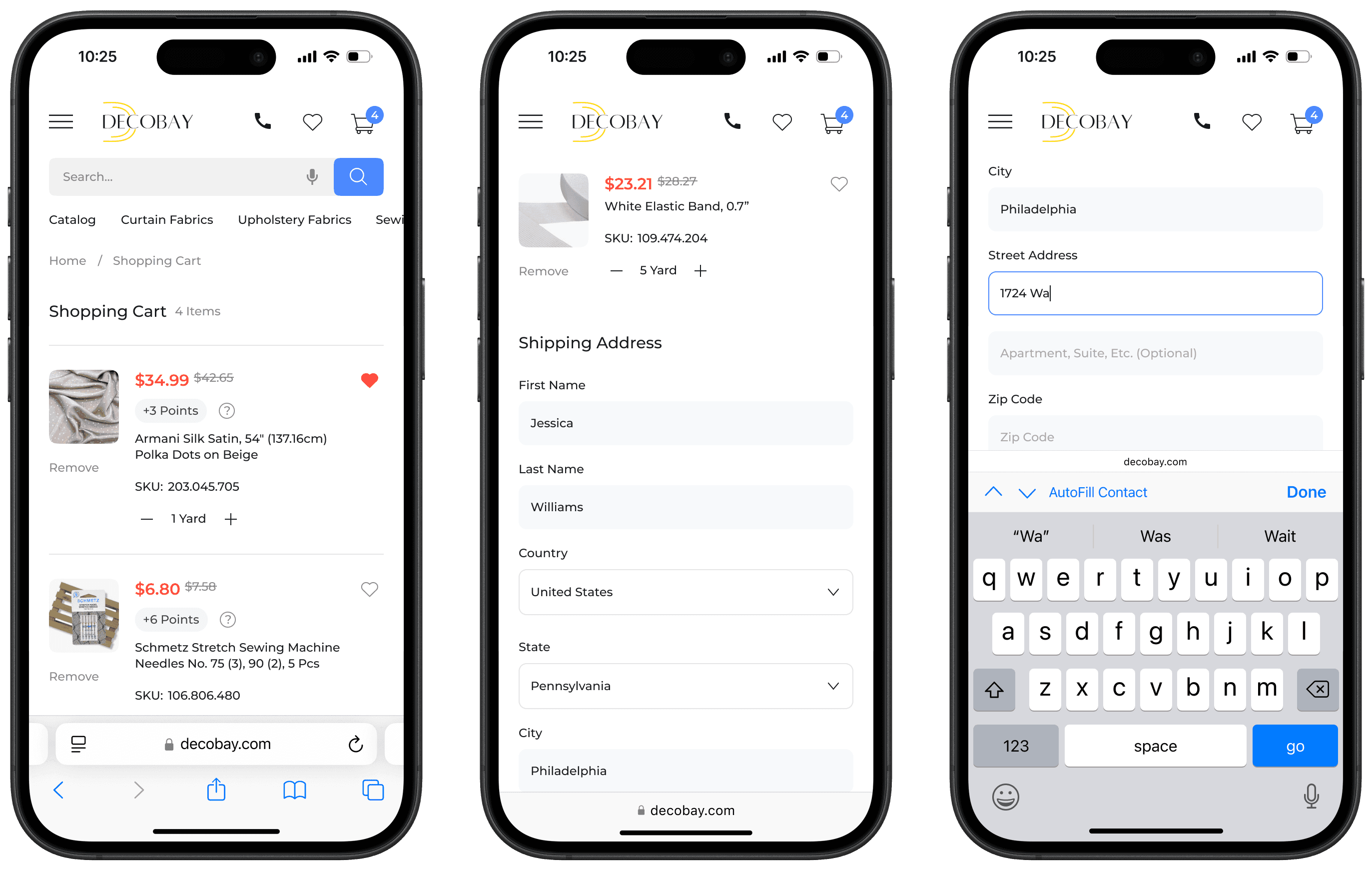
As part of the redesign, I restructured the page by moving the order summary block to the bottom and breaking it down into logically connected sections. This improved navigation, reduced cognitive load, and shortened the overall checkout time.
One of the design decisions made early in the process was to introduce a gamified element — a progress bar that visualizes the user’s path toward free delivery. It was originally intended to serve as a unified motivator throughout the entire user journey, from the product detail page (PDP) to checkout. However, during the prioritization phase, stakeholders decided to limit its use to the cart page only. This decision was based on business priorities and the phased rollout of new functionality.
Nevertheless, even partial implementation of this feature had a positive impact on user engagement and average order value. This further confirmed the effectiveness of solutions grounded in user insights and a flexible, iterative approach to product development.
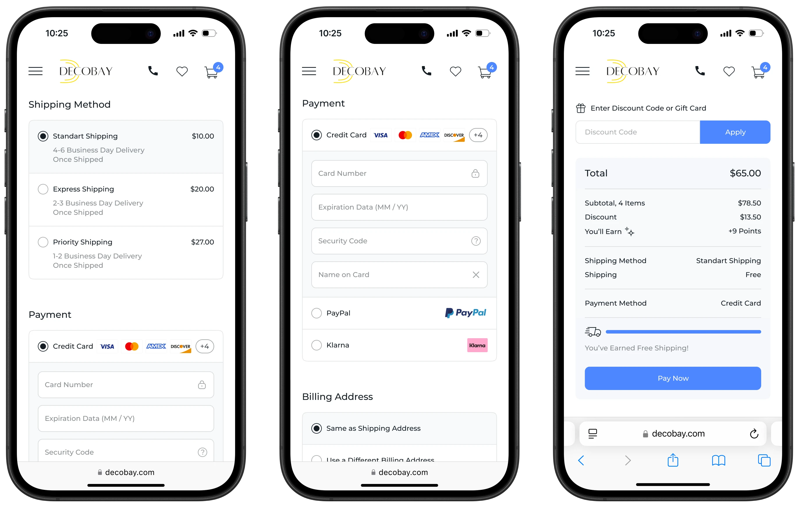
One of the key improvements introduced in the checkout page redesign was addressing the issue of losing context around the final order total, making the checkout process significantly more intuitive for users. I rethought the order summary block, visually dividing it into 5 logically related sections to enhance clarity.
At the top, the final order total is displayed. Below that, users see the full cost of all items before discounts, the discount amount, and the number of bonus points they will earn after the purchase (available to logged-in users).
Next comes the selected delivery method along with its cost, followed by the chosen payment method.
The section concludes with an interactive progress bar that both visualizes the path toward free shipping and encourages users to add more items to their cart. Once the minimum threshold is reached, the bar fills with blue and a message confirms that free shipping has been unlocked. If the threshold hasn’t been reached yet, users see a polite message showing how much more they need to spend to qualify.
This structured approach helps users complete their purchase with ease, without missing any important details, and makes the entire checkout experience more intuitive and user-friendly.
User Account:
Redesigned navigation to make sections intuitive, with easy access to order tracking and loyalty program details
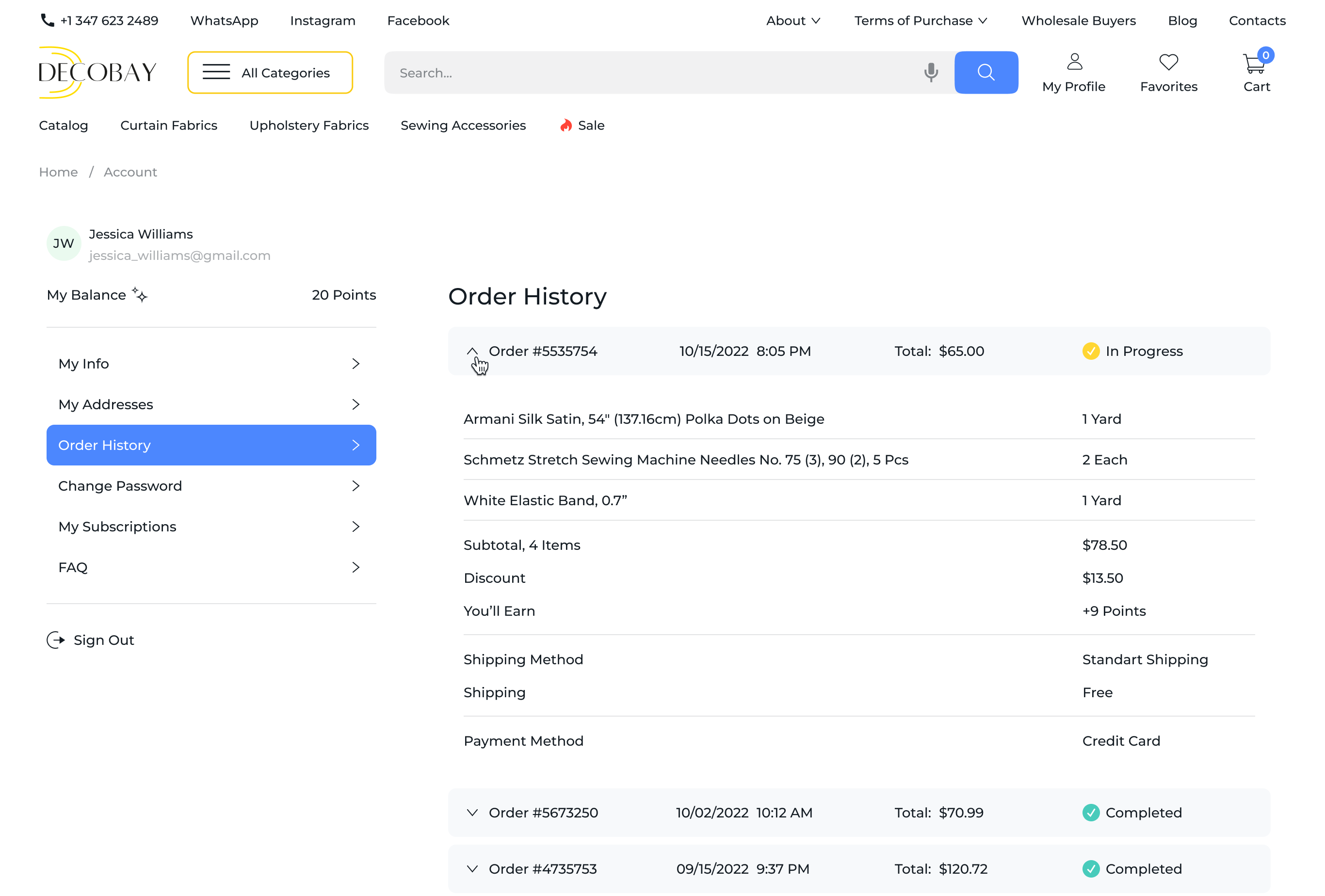
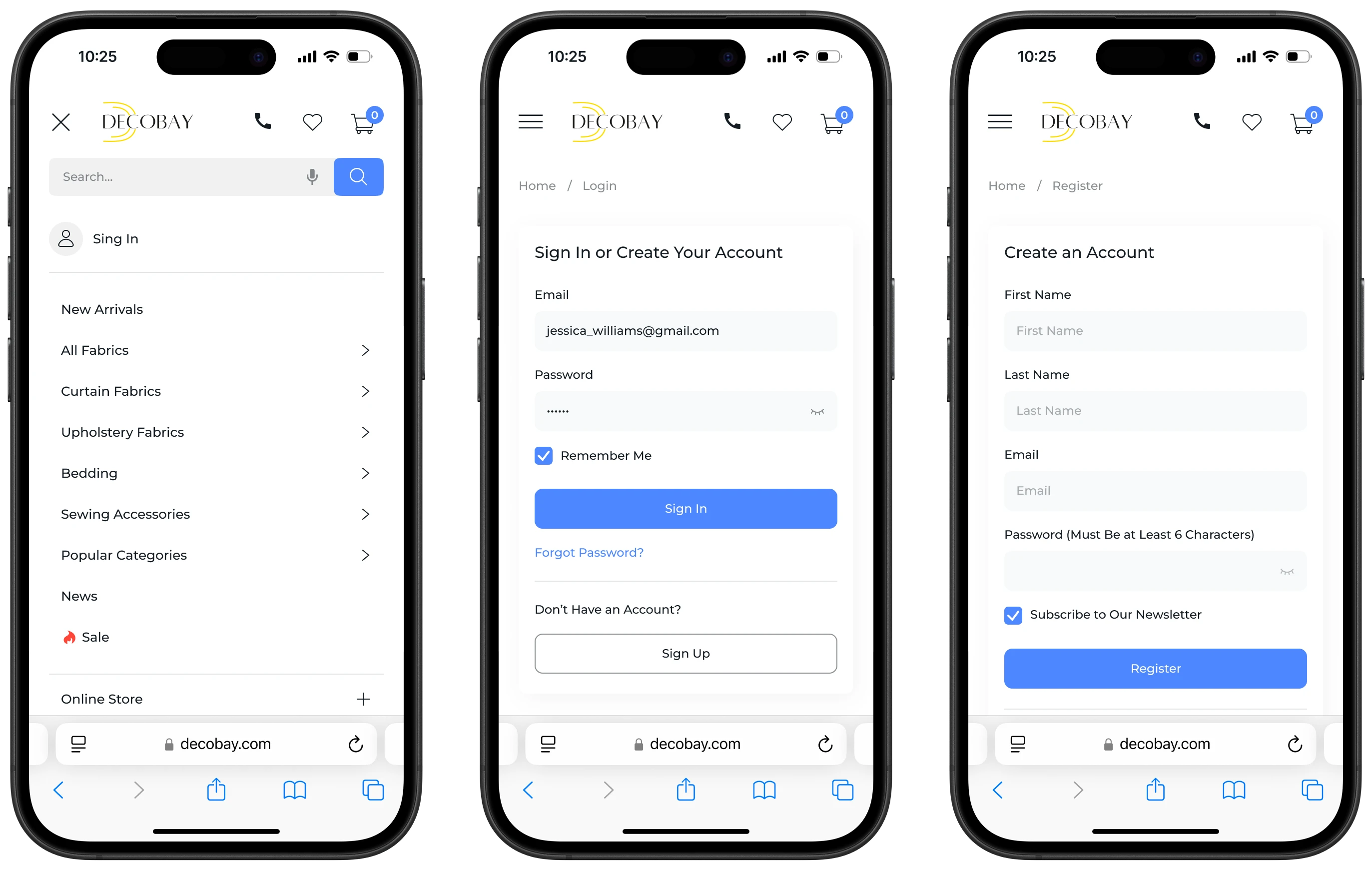
The original user account interface, while offering basic functionality, suffered from a chaotic structure, weak visual hierarchy, and low intuitiveness. The sidebar included five sections, but the internal structure within those sections was confusing and, at times, unclear. In the “My Info” section, the button labeled “Send” instead of a more intuitive “Save” caused user confusion and raised the question: “Why doesn’t the action reflect the intention?”
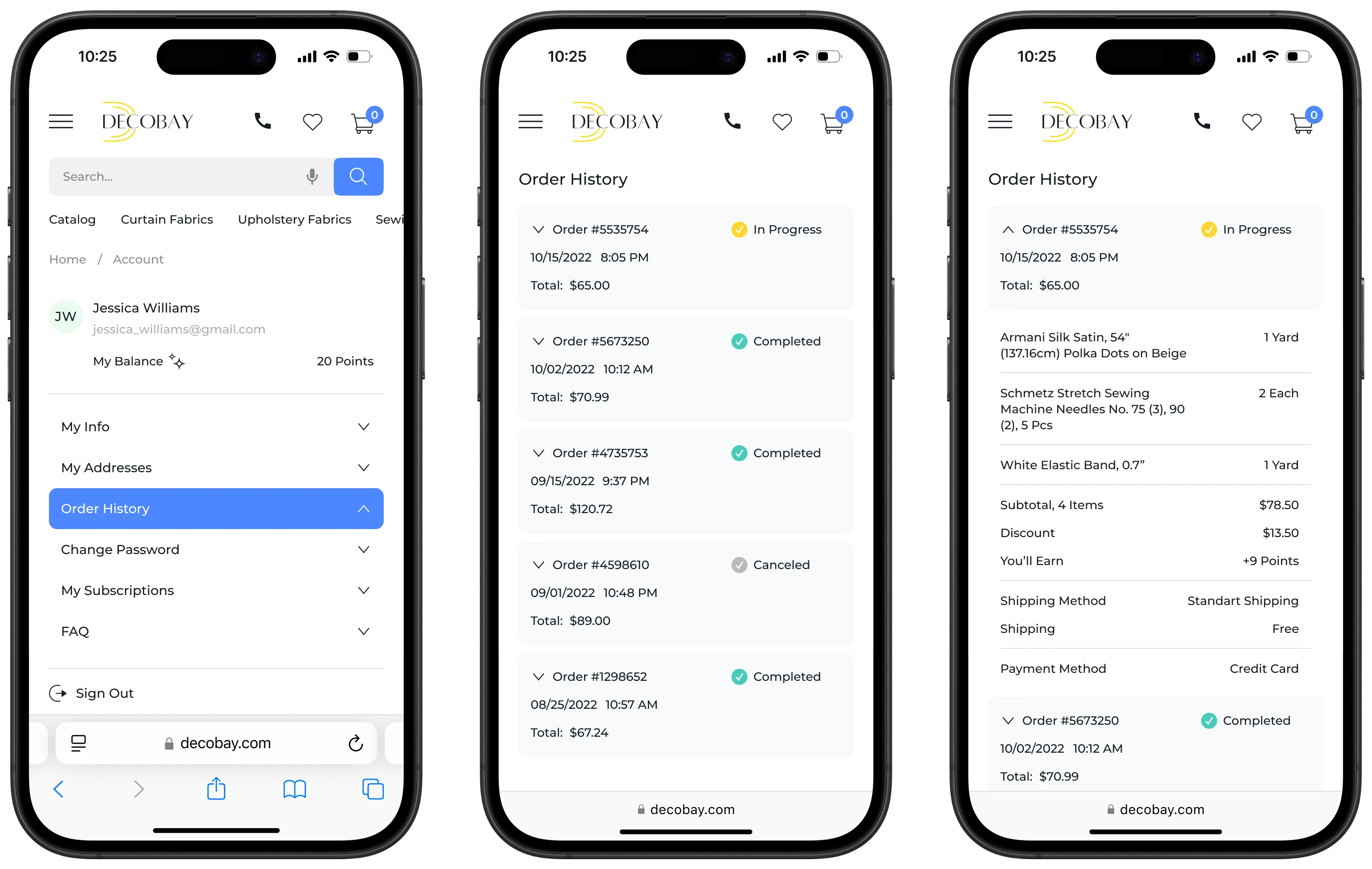
The “Order History” section was especially problematic: the lack of order statuses and detailed information made reviewing past orders a frustrating experience. This wasn’t just inconvenient and users were wasting time searching for information they couldn’t find. Visual inconsistency in typography, spacing, and button styles, combined with unpredictable system feedback, made interaction difficult. For example, during account registration or password changes, users couldn’t see the characters they were typing, which led to anxiety and input errors. The interface offered no guidance, only error messages. Additionally, the interface behaved differently on desktop and mobile devices, which added to user confusion.
My task was to transform this disorder into a user-friendly, intuitive, and scalable experience. I approached this challenge holistically and addressed key issues as follows:
I completely redesigned the structure of the account interface and implemented a unified design system. This brought consistency across all typography, button styles, spacing rules, shadows, and more
The password issue was resolved by introducing a “show/hide password” option across the Registration, Login, and Change Password pages, significantly reducing input errors and building user trust
The Registration page was updated to include a password requirements hint, which further reduced errors
The confusing “Send” button in the “My Info” section was replaced with “Save,” aligning the action with user expectations
Beyond that, I enhanced the sidebar navigation. The active section is now highlighted in blue, improving orientation. I also added a new section for “FAQs” to reduce support load and ensure users always have access to commonly asked questions.
The “Order History” section was transformed into a clear, accessible table with detailed information about each order: order number, date, total cost, and list of purchased items (product names, quantities, prices). Subtotals (Subtotal, Discount, Shipping) and payment/shipping methods were added to improve transparency. Order statuses were introduced as well, supported by color indicators — yellow for In Progress, green for Completed, and gray for Canceled. The use of clear segmentation and strong color contrast ensures the interface is also accessible to users with visual impairments. The entire user account interface was fully adapted for mobile devices, ensuring consistent behavior across both desktop and smartphone environments.